Birthday Invitation Card Maker
- 3.2
- Rating
- 500.00K
- Installs
- Free
- Price
 Analysis by App-foxy
If you need a birthday invitation quickly and would rather make something personal than send a plain message, Birthday Invitation Card Maker is a practical place to start. I approached it as a first-time user would: install it, choose a birthday-card direction, and see how far I could get before feeling lost. The app is free to download, aimed at Everyone, and comes from Gold Bridge Studio. Its focus is simple—creating birthday cards and invitations without requiring design experience.
My overall impression is that it works best as a quick creative tool, not as a complete event-management service. You can use it when a birthday is approaching and you want something that looks more thoughtful than copied text. At the same time, its modest average rating of 3.2 from around 336 ratings suggests that the experience is not equally smooth for everybody. I would recommend trying it when speed and personalization matter more than having a large collection of advanced planning tools.
What to expect before making your first card
The app sits in the events category, but its job is narrower than a full party-planning platform. I would think of it as a small design workspace for birthday invitations and greeting cards. That distinction matters because it changes what you should expect after opening it. You are there to create a visual message, not to organize guest responses, manage a calendar, or coordinate a complete celebration from one screen.
You May Also Like

 Blood Strike: 2.5 Anniversary
Blood Strike’s Loadouts Turn Every Drop Into a Tactical Gamble
A close look at Blood Strike’s custom loadouts: how fast access to signature weapons reshapes its battle royale rhythm, rewards preparation, and narrows the gap between fights.

 Pandora - Music & Podcasts
Pandora’s Music Is Easy to Start, but Harder to Recover
Pandora’s strength is its low-effort path from a seed to a station. Its weak spot is how much confidence it asks you to place in connection, setup, and quiet recovery.

 8 Ball Pool
 Is Built on Rivalries, Rematches, and Routine
A close look at the rivalries, rematches, shared routines, and unanswered safety questions that turn a quick pool match into a persistent mobile community.

 Samsung Music
’s Quiet Strength Is Playing What You Already Own
Its reach comes less from spectacle than from dependable access to a personal library. That simplicity is both the app’s strongest retention engine and its ceiling.

 AccuWeather: Weather Radar
AccuWeather Review: A Quick, Clear Forecast for Everyday Decisions
For everyday plans, the best forecast is the one you can understand quickly. AccuWeather makes rain timing, radar, and local conditions easy to act on, with a few trade-offs.

 Hill Climb Racing
Why Hill Climb Racing Still Turns Crashes Into One More Run
A tiny car, a bumpy hill and one more upgrade: Hill Climb Racing keeps resurfacing because its simple chaos makes every near-miss feel personal.
More From Our News Desk



That focused approach can be helpful. When I want to send an invitation to relatives or friends, I do not always need a complicated system. A card with the right wording, a suitable look, and the essential event details may be enough. The app’s store summary points directly toward birthday cards and invitation creation, so the most sensible first project is a simple invitation for a real upcoming celebration.
The free entry point is useful for testing the workflow before committing to anything. There are in-app purchases priced from $8.99 to $10.99 per item, so I would not begin by assuming every design or option is included at no cost. My advice is to make a basic draft first, understand what the free experience allows, and only then decide whether a paid item is worth it for this particular birthday.
It supports Android devices running version 7.0 or later, which makes it accessible on many older phones as well as newer ones. The current version is 1.0.35. I would still keep the first session relaxed: the goal is not to explore every possible design immediately, but to complete one useful invitation and learn where the app places its editing controls.
There is also a practical difference between a card and an invitation. For a greeting card, the main priority is appearance and a warm message. For an invitation, clarity matters just as much as decoration. The date, time, location, and response instructions should be easy to read. A design that looks attractive in a thumbnail can become frustrating if the important information disappears into a busy background.
Who will get the most from it
I see this app working particularly well for someone who wants a fast birthday announcement but still wants to choose the tone. Parents can use it for a child’s party, a friend can prepare a casual invitation, and a family member can make a more personal birthday greeting. It is also suitable for people who do not normally use design software and would rather adjust an existing visual starting point than build a card from a blank canvas.
It is less suitable for somebody who needs a formal invitation system with guest tracking, automatic reminders, or detailed event administration. I would also look elsewhere if you need highly precise brand-style control, extensive typography tools, or a workflow designed for printing large batches. This app makes more sense for individual, small-scale birthday communication than for professional event production.
Starting without overthinking the design
On the first launch, I recommend deciding what kind of message you are making before touching the visual details. Is it an invitation asking people to attend, or is it a birthday card intended for one person? That choice affects how much text you need and how direct the wording should be. Making that decision early prevents the common mistake of choosing a beautiful layout and then discovering that it cannot comfortably hold the information you want to include.
For a party invitation, I would prepare the wording in advance. Keep the essential details together: whose birthday it is, what is happening, when it takes place, where guests should go, and how they should respond. If the event is for children, I would also make any practical instructions easy to spot rather than hiding them in decorative text. A short draft makes editing much easier on a phone screen.
For a greeting card, I would start with the recipient and the feeling I want to communicate. A short personal sentence usually makes a bigger difference than adding several decorative elements. This is one of the app’s useful trade-offs: the visual design can help a basic message feel special, but it cannot replace a message that sounds like it was written for a real person.
From installation to a meaningful first result
I found the first session works best when I treat it as a small, real task rather than a tour of every design choice. Picking one recipient and one clear purpose makes it easier to judge whether the app’s starting points suit me, and it keeps the process focused on a card I can actually use. Before choosing a look, I’d decide what the message needs to say and how much room those details deserve.
Step one: choose a manageable first project
My strongest advice for a new user is to avoid making the first project ambitious. Create one invitation for one event. Do not begin by trying to design a multi-part announcement, a matching set of cards, or a complicated family celebration. A small first result lets you learn how the app handles text, layout, and final sharing without turning the process into a test of patience.
If you are preparing a real invitation, write the final wording before you start editing. This is more important than it sounds. On a phone, repeatedly switching between a notes app and a design app can lead to missing details or inconsistent wording. Having the text ready also helps you judge whether a layout is genuinely suitable instead of choosing one only because its preview looks attractive.
Once you have selected a direction, I would inspect the whole design before changing anything. Look for the areas intended for the main message and check whether there is enough room for your event information. A design with a large decorative centerpiece may leave very little space for practical details. In that case, a simpler option is usually the better choice, even if the more elaborate one initially catches your eye.
Step two: edit for readability, not just appearance
The most useful habit I found is to treat the invitation as something people will read quickly. Keep the event details grouped together and avoid scattering them across the card. If the app gives you control over text placement or styling, use those controls to create a clear order: birthday person first, event information next, and response instructions last.
I would also check the card at the size people are likely to see on a phone. A design can look fine while editing and become difficult to read when viewed as a small shared image. This is a non-obvious but important trade-off: adding more decorative text may make the card feel fuller, yet it can reduce the chance that guests notice the actual invitation details.
For a child’s birthday, playful wording may be appropriate, but I would still keep practical information straightforward. For an adult gathering, a cleaner layout may communicate the tone better than a highly colorful one. The app can provide the visual starting point, but the final quality depends on matching the design to the person and the event rather than selecting the most eye-catching option.
Step three: review before treating it as finished
Before sending the card, I would read it once as the recipient. Can I tell immediately whose birthday it is? Do I know when and where to go? Is the response method obvious? If the answer to any of those questions is no, the card needs another pass. This review is especially important because design tools make it easy to focus on alignment and decoration while overlooking a missing piece of information.
I would also look for accidental repetition, awkward line breaks, and wording that sounds too generic. A small personal detail—such as a friendly opening or a sentence that reflects the celebration—can make the invitation feel less like a template. The best result is not necessarily the most decorated one; it is the one that communicates the event quickly and still feels made for the recipient.
At this stage, I would save or share only after checking the complete composition. If a purchase prompt appears while exploring an option, do not let that interrupt the decision-making process. Return to the basic version of the project and decide whether the extra item solves a real problem. Paying for a visual element is reasonable when it improves the result you need, but it is not necessary simply because it is available.
Everyday scenario: a last-minute family invitation
Imagine that a family birthday is happening soon and several relatives are waiting for the details. Instead of sending separate messages with different wording, I would prepare one clear card in the app. I would choose a design with enough room for the date, time, and location, add a short welcome, and review the text at phone size. Then I would share the same finished invitation with everyone.
The benefit in that situation is consistency. Everyone receives the same information, and the visual card makes the message feel more deliberate than a rushed sentence. The limitation is that the app itself does not replace the communication step. I would still need to send the finished card through whatever messaging or social channel the guests already use, and I would keep track of replies separately if the event requires a headcount.
This is where the app’s focused nature becomes clear. It can improve the presentation of an invitation, but it is not the best tool for managing the entire event. If the guest list is large or attendance must be monitored carefully, I would pair the card with a separate planning method rather than expecting the design app to handle those responsibilities.
Common confusion during editing
New users may confuse a visually attractive card with a finished invitation. I made a point of separating those two ideas. A card can have a pleasing background and still fail if the message is too long, too small, or placed where it is easy to overlook. When in doubt, remove decorative wording before reducing the size of essential information.
Another source of friction is deciding whether to keep experimenting or finish the first draft. I recommend setting a simple stopping point: once the design is readable, the wording is personal, and the event details are complete, stop browsing. Endless comparison can make a straightforward project feel more complicated than it is. The app is most useful when it helps you produce something shareable quickly.
It is also easy to forget that an invitation and a greeting card have different priorities. A greeting can be expressive and minimal because the recipient already knows the context. An invitation needs practical information. If you start with a birthday-card style that leaves no comfortable space for those details, changing to a simpler design is not a failure; it is the correct adjustment for the job.
How the paid options affect the decision
Because individual in-app items range from $8.99 to $10.99, I would approach upgrades selectively. I would not pay just to make a one-time invitation slightly more elaborate if a free design already communicates everything clearly. On the other hand, someone who creates birthday cards regularly may value a particular visual option enough to justify the cost.
The sensible workflow is to identify the exact limitation first. If the problem is missing event information, a paid decoration will not fix it. If the problem is that the available design does not match the recipient or occasion, then an additional option may have a clearer purpose. This keeps the purchase tied to a real need rather than to the excitement of browsing.
What I would compare with the usual alternatives
Compared with writing a plain text message, the app offers a stronger sense of occasion and gives the sender more control over presentation. Compared with a general-purpose design editor, its birthday focus may make the starting point less intimidating for a first-time user. You do not need to begin with a completely empty project and invent the entire visual structure yourself.
However, a general design editor may be better when you need exact control over fonts, spacing, image placement, or print dimensions. A dedicated invitation service may also be a better choice if you need guest responses, reminders, or event coordination. I would choose this app when the main challenge is creating a birthday visual quickly, not when the main challenge is managing what happens after the invitation is sent.
The rating of 3.2 is worth keeping in mind when setting expectations. It does not make the app unusable, but it suggests that smoothness and satisfaction may vary. I would test the creation process with a low-stakes card before relying on it for an important event. That approach gives you a chance to learn the interface and discover whether its editing style suits you.
Who should skip it
I would skip this app if my priority were a detailed guest list, automatic attendance tracking, or a professional print workflow. I would also hesitate if I wanted a completely custom design with fine control over every element. The app’s strength is convenience within a birthday-card context, so users who need a broader toolkit may feel constrained.
I would also look elsewhere if I disliked the idea of evaluating optional paid items during the creative process. The free download makes experimentation accessible, but the presence of item purchases means that not every appealing possibility should be assumed to be included. Users who want a fully predictable, single-purpose cost may prefer a different route.
My next-step routine after the first card
After completing the first meaningful card, I would save the wording separately for future use, while rewriting the personal parts for each recipient. I would not reuse an entire invitation without checking the date, location, and response instructions. A reusable structure is helpful; blindly reused details are risky.
For repeated birthday projects, I would develop a small personal checklist: choose the card type, confirm the event details, edit the message, inspect readability, and review the final version before sharing. That routine turns the app from something you open only in a rush into a dependable part of a simple invitation workflow.
I would also keep the audience in mind when choosing the final design. Older relatives may appreciate larger, clearer text, while children’s parties can support a more playful look. A card that works well for a close friend may not be right for a family group. The app gives you a way to adjust the presentation, but the best choice still comes from knowing who will receive it.
Birthday Invitation Card Maker is a reasonable free starting point for people who want to create a birthday invitation or greeting without learning a complex design program. Gold Bridge Studio keeps the concept focused, and the Everyone age rating makes it approachable for a broad audience. With over 500K installs, it has clearly reached a sizable Android audience, even though the average rating shows that I would approach it with realistic expectations.
My recommendation is to try it for one small, genuine project and judge it by the finished result rather than by the number of designs you can browse. The key is to use the app as a fast card-making tool, not as a complete party organizer. If you need a readable, personal birthday message and are comfortable checking optional purchases carefully, it can save time and add warmth. If you need advanced design control or event management, a broader alternative will probably serve you better.
FAQs for Birthday Invitation Card Maker
01What features does the Birthday Invitation Card Maker offer?
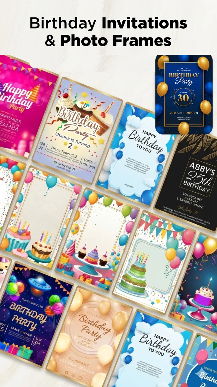
The Birthday Invitation Card Maker app provides a wide range of customizable templates for creating unique and personalized invitations. Users can add text, images, stickers, and backgrounds to match the theme of their event. The app also allows you to share invitations directly via social media, email, or messaging apps.
02Is the app user-friendly for beginners?
Yes, the Birthday Invitation Card Maker is designed with an intuitive interface that is easy to navigate for users of all skill levels. The step-by-step process guides you through selecting templates, adding personalized elements, and finalizing your design, making it accessible even for those new to graphic design.
03Are there any in-app purchases or ads?
While the app is free to download, it includes in-app purchases for premium features, such as exclusive templates and high-resolution exports. Additionally, users may encounter ads, but these can typically be removed with a one-time purchase. This allows for a more streamlined and uninterrupted design experience.
04Can I use my own photos in the invitation designs?
Absolutely! The app allows you to upload your own photos directly from your device, enabling you to create a truly personalized invitation. You can adjust the placement, size, and orientation of your images to fit perfectly within the chosen template, giving you full creative control.
05Is the app available on both Android and iOS platforms?
Yes, the Birthday Invitation Card Maker is available for download on both Android and iOS devices. This ensures that users can access the app regardless of their device preference, making it versatile and widely accessible for creating invitations on-the-go.
Pros
- User-friendly interface for easy navigation.
- Wide range of customizable templates.
- Integration with social media platforms.
- High-quality graphics and fonts.
- Supports multiple languages.
Cons
- Limited free features without subscription.
- Occasional ads disrupting workflow.
- Some templates require in-app purchases.
- No offline mode available.
- Lacks advanced design tools for experts.

Birthday Invitation Card Maker
Gallery